Showing posts with label reprint. Show all posts

Friday, November 19, 2010

REVIEW: Marjorie Kramer at Julian Scott Memorial Gallery in Johnson

By Davis Koier

This article first appeared in Johnson State College’s Basement Medicine, Arts & Entertainment section, on November 11, 2010. We are grateful to them for allowing us to reprint it. – Ed.

“The world might not be a pretty place, but it’s beautiful.”

Adjunct Art Professor Marjorie Kramer’s recent show at the Julian Scott Memorial Gallery, [on exhibit from October 18 through November 6, 2010] features a series of Kramer’s recent paintings of subjects from vibrant flowers to more somber toned still lives depicting New York grandeur and small town stark simplicity.

Kramer became interested in art at a young age. “When I was in second grade my school had a PTA meeting at night and I was chosen to paint a mural on the wall of one ring of a circus. It was a little triumph for me, I did well and it was fun and I got to be thought of as the class artist. Then I started drawing horses and dogs, mostly horses.”

Since then, Kramer has developed into an accomplished perceptual artist. A member of the New York feminist movement in the 1960s, Kramer tries to focus more on feel and sensation in her work rather than trying to convey specific ideas.
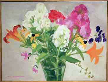
Kramer’s flower paintings range from the abstract to the more well defined, using pinks, purples, oranges and reds against simple backgrounds to capture the energy of her subjects.
“These flower paintings are my fairly new subject. After many decades I got tired of using so much green paint in painting fields and woods,” Kramer said. “I thought that I could do the flowers almost as an abstraction, I wanted it to be about the whole surface and have rhythm and color, it was a great excuse to have color.”


Kramer’s paintings of New York City use earthier tones, making looming downtown buildings take on a comfortable, familiar aspect.Kramer has spent a large amount of time in New York. She got her BFA at Cooper Union before helping to establish the New York Studio School, which initially didn’t offer degrees but instead chose to focus as intensely on art as possible.

“I quit Cooper Union and went off with [my favorite painting teacher] and 20 other students from other arts schools…” Kramer said. “It was very exciting, that was the 60’s and was very democratic, we made lunch for everybody, got the library together; a lot of the students were models. We had drawing, painting and sculpture, no required courses though most people were politically active then. People were questioning what was being taught in colleges, if was it really relevant.”

After leaving the school, which has since expanded to offer Master’s degrees , Kramer went on to spend around 15 years in New York painting and working in galleries. “For a while I was an artist’s model, and then I got a job managing an art gallery in SoHo,” Kramer said. “I got to know many of the artists in New York and became part of that community. That was my training, I then got angry and rejected a lot of the stuff that my teachers had taught me, and starting coming to Vermont in the summers, just figuring out what I really wanted to do with my art without having a teacher looking over my shoulder. I did all of that until I was about 30.”

After rising rent prices made New York life difficult, Kramer and her husband moved to Vermont, where Kramer began an art program at the Lowell school where her daughter attended kindergarten. Afterward, she expanded to other elementary schools before deciding she wanted to begin college teaching. She spent time working at the Community College of Vermont before coming to teach at Johnson State College.

Many of Kramer’s paintings have a sort of simplicity to them that can distract the viewer from the amount of time and energy she’s put into them.“It’s not that you’re always inspired and want to express it,” Kramer said. “You see something you think you could work, and want to work. You start to work on it and start thinking ‘this is very beautiful and simple,’ and find that the actual process of working is one of the best sources of inspiration.”

Kramer’s show also included a few nods to her feminist background, most notably a self portrait holding a picture of Hilary Clinton and a small, somber-toned painting of two women in close conversation. While exploring different ways to convey emotion in her work, Kramer also tries to impart some of the things she’s learned to students.

“I’m especially interested in perception and the process of painting,” she said. “I’m more interested in teaching the means than the ends. The wonder of sensations and light, it’s not just expression. It’s just amazing that a pencil with paper or a stick with animal hair at the end of it and oil and ground up soil, pigment, can express the human spirit, and has now for thousands of years. It might be a bit of a dull world without art”

Images:

Still Life After Seeing A Derain in Paris, 20" x 22", oil on linen, 2010
Lower Manhattan from Governors Island with S.I. Ferry, 32" x 25", oil on linen, 2007
Midsummer Flowers in Abbreviated Vase, 18" x 24", oil on linen, 2010

Tuesday, December 22, 2009

INTERVIEW REPRINT: Stephen Orloske interviews Emily Wilson

This is our second reprint of an interview by Steven Orloske, originally posted on the Borough Gallery and Studio's blog. I saw the piece Looking Inside Out (three images of which can be seen in this review) in the hallway outside the Borough Gallery last week, and was completely absorbed by it for at least half an hour. It is a complex, engaging installation, mounted with perfect craftsmanship. Emily says that she will leave it up through the end of January. But, "since the SEABA entrance has inconsistent open hours right now," Emily says, "appointments can be made to view the piece by sending me an email at ewilson.art@gmail.com " -- JVF, ed.

Stephen Orloske: Your installations seem to burst, like they’re in the process of organic growth, yet they also have a careful, mathematical structure to them. What’s it like creating that effect? Is it mostly play, or agony to get it right?

Emily Wilson: This piece exemplifies the true process of site specific installation and the overall transformation of space, materials and limitations. I worked mostly from inspiration of the physical space. Responding to the layers of mortar and brick as well as the skylight, overall wall height and the room layout. I essentially was bursting during the actual installation. It was very physical. Full of movement, rhythm, gesture. It represents the energy, enthusiasm and ethic I have for my work. I wanted to create something that allowed others to step into a world that is completely created by me. The layering of colors, values of buttons and repetition are all intentional and especially constructed for this piece, in this space, for this show. At the end and nearer to its full completion I began to edit and add various components, which was challenging and the only part that became grueling. I was looking for a specific balance, simplicity and overall startling affect, which initially was hard to achieve. But as I became more familiar with the piece, within the space, I was able to finally distinguish what needed to be done in order to finish.

SO: If your installations start with the space, have you ever walked into space where you’ve been asked to create and felt intimidated or stumped? Have you ever had a space where you and it just did not get along?

EW: Only once that I really, really remember. Actually, it was one of the more important learning experiences in my artistic career. There was a project I was committed to in a corridor space. It was two walls outside of a gallery space and was a travel way for students to and from the stairs. There were two staircases that led up to this area, and two stairways that went to the level above. The walls were 10 feet high by 22 feet long, on both sides of a set of double doors that were in the middle, that led to the gallery. It wasn’t a challenging space, per se. It was relatively familiar. However, I thought I had developed this great plan, and I had, on paper. I had designed a piece that I thought was powerful, uniform, responded to the movement of the space, reached for simplicity, but had an overall impact. When I got there, I unpacked and took out my drawings and plans. And I had planned it so carefully I did exactly what I planned on paper… measured down to nails. 8 or 10 hours later, I stepped back. Done. Excited, because it looked exactly like my drawing, exactly what I wanted this planned, conceived project phenomenon to be. I left satisfied. The next day, as I approached the stairs as any other student would that day, I looked at the piece. And was so unimpressed. So lifeless, so perfect, so idealized. It didn’t respond to the space or communicate with it. Rather, it sat, placed on the wall, like a drawing. Planned, mediated, framed, matted, and hung. That night I took it down. I used the materials to build something within the limitations of the space, while trying to mimic the excitement and energy that Williams, the Art Building had. The next day when I approached the same stairs as I had the day before, I was psyched because it worked! I was interested in my own work on a whole new level and realized how essential the total engagement with the space is, and more so realized that the space is just as much a material as paint or paper is… it has color, depth, texture, mass amount… you respond to watercolor one way, you respond to brick in another.

SO: Your windows and paintings still have the same energy as your installations, yet they can’t start with a space. Where do you start with those pieces?

EW: They still start with space. In a sense I build my works from the medium I have, the limitations of the space I can work within, and other constraints. For example, I usually approach a new project with a very simple idea or inspiration. A quick thought about something I’m curious about or find appealing, and then I turn to what I have. Whether it be an 8′ by 10′ canvas, a postcard -sized piece of watercolor paper or a new storm window, I choose something to spark my interest further. Then I turn to unique materials and try to catch the specific energy, inspiration, and innovation in a two -dimensional or three -dimensional form, specifically in a design -oriented manner. Drawing is the best way for me to capture the exact product that I hope for or urge for in painting, installation and sculpture. I learn from my drawings the path to building other things. Even if they are not exact replicas of each other, they stem from each other and in turn progress each other.

SO: Is there any non-artistic, or non-creative activity that you do that in turn inspires or aids your art?

EW: I am not sure anything I do is non-artistic or -creative. I've realized that I approach most of what I do as a project, maybe even an installation project. Most of my daily tasks have the goal of being aesthetically pleasing and completed timely - in order to create a living environment I can flourish in. From folding clothes, to putting away the dishes to making my bed; each activity becomes a project in itself. I also have a lot of collections. I collect scarves, bags, funky jewelry, tea cups, small dishes… Each one of those have been inspirational in one way or another. I am also active. I like to run and hike… which might enhance the overall physicality of my pieces.

SO: When you were five what did you think your life at twenty-five would be like?

EW: I think I pictured myself as a grown up. Thinking it was much like playing house and setting up my dollhouse. I had mature hobbies at a young age, which enabled me to develop an extreme taste in home decoration and design. I remember thinking of grown up outfits and shoes… I never really thought of exactly what I would be doing for a job etc. Maybe that's why I am struggling now! But, the real answer is I think I always pictured myself being a grown up version of what I was then. Doing the same things I did then, but better because I could have my own house to set up in and car to drive. Ive been on an artistic journey since I was born. Going through phases of interest, talent, motivation and development.

You can read more about Emily Wilson on her blog at www.emilynwilson.wordpress.com

Images above: "Looking Inside Out" 8' x 12', ribbon, yarn and nails, site specific installation Borough Gallery & Studio Entrance

Tuesday, December 15, 2009

INTERVIEW REPRINT: Stephen Orloske interviews Jude Bond

Over the next several weeks we will be reprinting some interviews with Vermont artists conducted by Steven Orloske and posted originally on the Borough Gallery and Studio's blog. -- Ed.


Borough Gallery and Studio: You often use images of “TV Women” from the mid-twentieth century. What do you think “TV Women” today are like? Are they prodding the same desires/anxieties as in the 60s, or do they present whole new problems for women and their identity?

Jude Bond: I grew up in the early days of television. My sister and I watched many shows about the supposed happy family life. There was Leave it To Beaver, Father Knows Best, The Donna Reid Show, and many more. The women in all these shows were moms and they were all “stay-at-home moms”. There was very little discussion about a career other than being a homemaker.

These women were running the household and not a corporation but were bright savvy women. They did all the cooking and the cleaning yet still had a certain glamorous appearance. Their houses were shiny, and so were they. These were “domestic goddesses”.

The women I recall as “Sirens” or “Sex Kittens” were single and appeared more often in film than in television. They were women like Marilyn Monroe and Ann Margaret. They were not usually wives and mothers. They were the girlfriends, or the object of some man’s desires.

In fact the most significant media role model I had as a girl was in literature not television or film; the incomparable Nancy Drew. This series for young girls had a powerful influence on me. Nancy gave me courage and hope through all of her adventures and escapades. She was afraid of nothing, and she was also smart and kind. She used her intellect and her sleuthing skills to help people, which appealed to me. When I was reading these books in the early 60’s there were few female heroines in literature for girls to emulate, and I was utterly and completely hooked.

A few years back I did a series about Nancy Drew. I re-read a couple of the books while working on the series and they are cheesy and dated, and yet so, so good. In the Secret of The Old Clock Nancy gets locked in a closet and manages to escape by using the closet pole as a lever to jimmy the door off its hinges, saves a child from drowning, rescues an old woman who had a bad fall, changes a flat tire, fixes a broken motorboat engine, and of course, also solves the secret in the old clock and brings a much deserved fortune to family and friends of a recently deceased gentlemen whose last will and testament could not be found. Whew! Wow! And all this while also dressing smartly and being warm and friendly to all she comes in contact with.

But back to television and your question…

What is most interesting to me about television shows from this time period is something no-one ever seems to talk about. This is the curious fact that there were several shows in which the mother had died. There was My Three Sons, Sky King, Bachelor Father, Bonanza, just to name a few. In these shows it was as if the absent mother enabled the surviving father and children, whether young or old, to take on roles they would not have been allowed to have otherwise. The men got to be the nurturers as in My Three Sons, or got to go on dates, as in Bachelor Father, or the female child got to have more adventures than perhaps an overprotective mom would have allowed, as in Sky King. This was also the case in the Nancy Drew mystery series. Nancy’s mother had passed away and her father was less protective than perhaps a tv or novel mom of that time would have been, allowing her to have a life filled with dangerous adventures.

TV women of today exemplify a much broader range of options than those of yesteryear. Today’s TV women are doctors, lawyers, cops, judges, car dealers, designers and moms and housewives. Yet, some of the same underlying stereotypes still apply and some of the same struggles exist. What I find most interesting about contemporary television is that one of the most popular shows is Mad Men, which is set in the 50’s and 60’s. Several of the key female characters intrigue us precisely because they do not fit the mold. They do not behave as we might expect from a show set in that time period. They are not kind and loving mothers, or good Catholic girls, or long suffering secretaries or wives. They are questioning their roles and daring to step outside the parameters of tradition.

BGS: Your art uses traditional domestic skills, stitching, quilting, etc… yet you say you’re not a “domestic goddess” yourself. What was it like learning these skills and applying them to art that asks the viewer to question their tradition?

JB: You are correct. I am not a Domestic Goddess. I come from a long line of Domestic Goddesses, but I did not inherit the gene. I grew up in a time when moms stayed home and cooked and cleaned and sewed and had dinner on the table each night with meat, potatoes, vegetables and a home-made dessert. My mom sewed matching dresses for my sister and me, knitted sweaters, stitched quilts, hooked rugs and embroidered pillow cases.

As a young girl I was taught to embroider, sew, and crochet. I spent many pleasant hours in solitude practicing these skills. I loved the techniques, but as I came of age I avoided them as if they would create snares that would trap me in the domestic life.

As an adult I returned to “women’s work” and the medium I love, to create works about home and domesticity, and to address issues of women’s roles in contemporary society. Using this medium to comment on the very thing that it has come to represent appeals to my sense of humor and irony. It also gives a new view to the long history of “women’s work” as fine art.

BGS: Snares and traps are also present in the creative process: creative blocks; anxieties and fears; addiction to research and information; getting caught in imitation of another’s work. Are there any traps your art has been caught in and now learned to avoid? Are there parts to your process where you must tiptoe to avoid being ensnared, and others where you can run without fear?

JB: This is an interesting question and very relevant to me. Over the years I have dabbled in many different mediums. What I have found is that when I do more traditional work, say painting or drawing, there is a constant voice in my head that says things such as “that is not the way it is done”, or “that is not good enough”, “you are not a painter” etc.

I am very drawn to traditional landscapes and still lifes. If you saw the art work that adorns the walls in my home you might be surprised, as it consists almost exclusively of paintings that were purchased for a few bucks each at yard sales. These paintings touch me with their earnestness and encourage me to try again someday when perhaps the voices have abated.

In contrast, when I work intuitively with a vast array of elements gathered from near and far, I never hear these discouraging voices. Quite the opposite, I get energy and encouragement from the elements I piece together; from the doilies, undies, gloves and textiles. I feel completely free to make the work the way I wish to, and in the way that my muses lead me. The only things that hold me back are technical issues, and then I just set out to learn the new skills necessary to complete the work the way I envision it. Often these technical solutions come to me in dreams and I awake in the morning with a pleasant little “aha”.

I am happy to say that I have never had a creative block since I began to make art seriously. I feel very blessed in this regard. I awake every day bubbling with ideas and am blocked only by time constraints placed on me by real world demands, such as work, socializing with other humans, and ordinary daily tasks.

BGS: Do you have an idilic home/lifestyle that lives in your head? Throwing away all of reality’s restraints, what would your typical idilic day consist of?

JB: My ideal scenario is as follows: I am independently wealthy. My home is in the countryside. It is a beautiful old rambling farmhouse. There are rolling fields for long walks and a brook or pond for dipping on hot summer days. My studio resides in a refurbished barn with high ceilings and lovely views. There is plenty of organized storage for my collections of art making materials. I have the time and money to go on seasonal forays to hunt and gather at rummage sales, yard sales and thrift shops for unique art making finds. I have a once a year give-away to move wonderful materials back out into the world for others to utilize and enjoy. There is a beautiful space in my studio to teach workshops and classes for adults.

Most mornings I awake early and carry my coffee to the studio to begin my day. Most days are spent here. I do not have to earn a living through my teaching or my art or craft work, but choose to volunteer in the Early Arts program I now coordinate. Once or twice a week I go into town to teach art to preschoolers in their classrooms. This keeps me in touch with the joy, spontaneity, and seriousness of art making. The children inspire me and keep my work fresh and make me feel like I am giving back to the community in some small way.

I am still a member of 215 College Gallery, so I have the support, encouragement and opportunities that provides. I also show at other galleries across the country from time to time and have the flexibility in my schedule to allow for these travels and opportunities. Life is good!

See more of Jude Bond's work at the 215 College Gallery website.

Images (top to bottom):
Jude Bond in front of Niagara Falls, 7x11' hand painted backdrop; Yo Yo Domestic Goddess/Sex Kitten (detail);
Hand in GLove #2, textile; Finger in the Pie, art textile, 2007; Tomatoes, textile and metal sculpture

Tuesday, October 20, 2009

REPRINT: Cheryl Betz at Claire's in Hardwick

Paintings Offer An Abstract Window On Reality

by David K. Rodgers
Originally published in The Hardwick Gazette and reprinted by permission

Cheryl Betz’s paintings, now on exhibit at Claire's Restaurant, demonstrate the paradox that abstract art can sometimes show reality better than realistic works.

The dominant characteristic of her paintings is an uncanny glow in their centers, which almost seems to emanate from the surface rather than just being reflected off of it. Are we looking within ourselves, to mystical experiences in the deeper levels of our minds through intense meditation (a kind of “inner Northern lights”) or are we seeing the true nature of the universe as revealed by contemporary nuclear physics, where below the surface on the molecular scale everything merges in constantly changing fields of energy; or are we here doing both simultaneously?

Paintings don't come into being all at once but grow in sequences as they are created, with a considerable amount of improvisation (as in music) along the way. It is interesting to reconstruct how Betz achieves this unique quality of light in her works. To start with, she paints in a medium
of oil and beeswax on linen, which gives the surface a mellow sheen, like the patina on old furniture or bronze sculptures, subtly sensuous.

In her artist’s statement, she describes how she begins with the “intricate structures of various phenomena that occur in the natural world,” but then obscures these forms with many layers of paint, so the overlaps merge in a rich visual mix. Looking closely at a painting by Rembrandt,
Turner or Monet, for example, reveals the same building up of numerous blending brushstrokes of color, creating a beautiful vibrating effect. In Betz’s pieces, these glowing areas are heightened by juxtaposition to her subdued palette of dark greens, blues, reds, ochre yellows and browns on the edges, which shade to black on the borders, where the lack of any kind of formal frame makes the paintings seem to hover on the wall.

Within her floating compositions we can discern on the periphery vague repeated patterns of lines, which as the titles indicate (Of Veins, Fucus Vesiculosus Linnaeus, Husk, etc.) suggest the veins of leaves (or those of our own bodies) essential to the circulating of life’s vital fluids, as well as the rounded forms of cells, seeds or eggs, perhaps symbolic of the rebirth and continuity of life. Other paintings, such as the Isle Au Haut series, seem to spring from the horizontal bands of natural landscapes.

Two additional associations these works bring to mind are, first, the startling luminosity clouds sometimes take on at certain times of day. This is analogous in an inner sphere to what the mystic Jacob Böhme calls the “Cloud of Unknowing.” Second, on a more cosmic level, they suggest the auras of distant galaxies and supernovas the Hubble Space Telescope discovered.

This exhibition of Betz's paintings will continue until Nov. 23.

This review is reprinted, with permission, from The Hardwick Gazette

Images from top
: Fucus Vesiculosus Linnaeus, Axial X

Thursday, July 16, 2009

REPRINT: THE DECORDOVA'S BIENNIAL: A VERMONTER'S PERSPECTIVE

by MARC AWODEY
On the morning Big Red & Shiny published a blog post about the DeCordova’s 2010 Biennial selections, a Vermont gallerist shot to my publisher and me -- I’m Art Critic for the Vermont alternative weekly Seven Days -- a fiery e-mail saying “How is this possible? Is VT no longer part of New England? Are all of the artists in this state so bad that they couldn't find one to meet their criteria?” In the article, Big RED listed the Biennial’s seventeen selected artists along with their home states. Seven hailed from Massachusetts, four from Maine, three from Connecticut, two from Rhode Island, and one from New Hampshire. DeCordova Assistant Curator Dina Deitsch, who had made the selections, with help from an advisory board that includes Mark Bessire, Director, Portland Museum of Art, George Fifield, Director, Boston CyberArts Festival, and Jennifer Gross, Curator of Modern and Contemporary Art, Yale University Art Gallery, was quoted in the piece as saying “The goal of the 2010 Biennial is to provide a snapshot of the broad range of art practices that are currently happening in New England, while being mindful of the traditions that feed those very practices.”

If the goal had been a snapshot of greater Boston, or of states that touch the Atlantic Ocean, Vermont excluded was just fine. But Deitsch said “New England.” Our Daily Red’s article also mentioned: “the DeCordova is hoping to collaborate with alternative exhibition spaces throughout New England to ‘create multiple-site installations’ to link the ‘exhibition with [other] artistic hubs.’”

So to try to figure out why the DeCordova didn’t find a worthy Vermont artist, and perhaps how an invisible place could qualify as an officially sanctioned “hub,” I got in touch with curator Deitsch. She immediately cleared up some basic misconceptions, and imparted valuable background information.

Their biennial idea, new for 2010, is an outgrowth of the DeCordova’s past annual exhibitions and they “have never managed to represent all 6 New England states in a single show nor have we ever aimed to do so. The idea of these shows being that they are showcases for work being made in the New England region...” Deitsch said. That’s fair enough. Perhaps in the future they shouldn’t highlight where the artists are from, so that the odd states out won’t feel snubbed. Deitsch also wrote, “It is not intended to be a comprehensive, encyclopedic account of New England’s art scene, nor is it, in any way, considered to be a ‘best of’ show.” That’s a departure from the DeCordva’s 2007 show statement, which states, “Each year the DeCordova Annual seeks to feature some of the best, most innovative and gifted artists working in the region.” It’s good news that the subjective word “best” doesn’t apply anymore. That point really needs to be clarified to the public. The idea that biennials aren’t more important than annual shows and that the DeCordova doesn’t try to hang the “best” work it can find, ought to be communicated to galleries, collectors and maybe the selected artists as well.

Considering how little I knew of the world south of U.S. Route 4, some in-depth Google research about the DeCordova’s biennial selections was in order. Deitsch mentioned the museum’s show will feature “both emerging and established artists.” But how could they tell who’s emerging, and who’s staying submerged? While that’s a puzzle I couldn’t solve, I did discover that five or six of the high profile artists to be exhibited in the Biennial are of the video/performance category. Well maybe that seems excessive considering the stated objective, according to Deitsch, of looking at “a broad range of art practices,” and “being mindful of the traditions that feed those practices” but video is more intellectual and less entertaining than watching a typical big screen TV. The DeCordova will demonstrate that in 2010.

Unfortunately, I also saw some nasty postmodern clichés during my comprehensive, encyclopedic Google searches. Irony is to aesthetic content as cotton candy is to the Healthy Eating Food Pyramid, and it’s turning into one of those traditions that feeds contemporary artists. The phenomenon also devours everything in its path: formalism, introspection, beauty, genuine unfeigned angst. I’ve also noticed that just because someone has an idea, that doesn’t mean it’s a good idea. Take 2010 Biennial artist Greta Banks’ quote from The Portland Phoenix regarding some of her new work: “Everyone has an anus but everyone goes out of their way to never admit that they have one...” Wow. Saint Thomas Aquinas couldn’t have said it better. Another Biennial artist, Randy Regier, has a piece that seems to be deconstructing the mythos of G.I. Joe? Liz Nofziger has other hackneyed doll references on her web site. In fairness, she has some interesting installations documented also - well, maybe not Verde, which is like Christo, except green.

The neo-sci-fi kitsch tradition of Alex Grey seems to be explored in all seriousness by Biennial artist Paul Laffoley’s mandalas. Designer Christopher Mir drops bombs on more or less the same rubble. Phil Lique’s 2-d art looks better than his installations, which seem rather self-important, and are nothing compared to what Dada was doing ninety years ago. Those selections are more like a snap shot of Chelsea in the 1990’s than of New England today. They don’t seem representative of the working class artists of New England I admire. Vermonters Bill Ramage or Alisa Dworsky really should have been Googled by someone at the DeCordova.

On the other hand -- again based on my “research” -- Biennial artists Laurel Sparks, Ward Shelley and August Ventimiglia’s installations do have some real meat on their bones. Oscar Palacio’s photography and anything by the distinguished Otto Piene are also going to be well worth seeing. Officially, the DeCordova wants to “put together a show that is visually compelling and has something to say about the state of contemporary art today,” and it will definitely say something. Yet to be seen is how much of the installed Biennial will be devoted to predictable, and ultimately insecure, “tropes” (to use the word de jour) that make so much contemporary fine art pretentious, Baroque, irrelevant and forgettable.

Regarding Vermont’s invisibility in 2010, the topic of such uppity discussions around here - nuff said. Our being incomparable to Boston, and visa versa, isn’t such a bad thing.

above: Bill Ramage. The Centripedal Gates of Kiev (detail), mixed media on canvas, 40-by-8 feet. Photo: Marc Awodey
Essay first appeared in Big Red and Shiny

Tuesday, March 24, 2009

REPRINT: Lucinda Mason at the Supreme Court, Montpelier

By Maggie Neale

It has been my honor to be able to hang an exhibit of Lucinda Mason's paintings at Vermont Supreme Court. It is a grand space where large paintings can actually be seen; Lucinda's paintings deserve to be seen. She was only 32 when she died suddenly in March only 2 years ago. She had just completed her Superconducting Super Collider Suite and she had used up all her paints and perhaps all her energy. She died peacefully in her sleep, but too young.

Now with her paintings out to breathe again, I can feel her spirit still searching and being joyous too. These paintings are truly magical and wondrous. From her latest writings, she was asking herself questions, such as, "What does space look like inside the nucleus of an atom? Can one paint immeasurable space? Can one paint the essential makeup of energy?"

Because I was asked to take some photos of the installation, the true scale of these paintings shows up when men are lifting them. I was grateful for the assistance of Torin, Darrell, David, and Tracy to hang this show and for the faith of Ticona, Lucinda's mother, that we could honorably bring Lucinda's paintings out for show.

The reception is this Thursday, 5-7 and the show will continue through May 1. It is worth seeing again and again.

Monday, February 2, 2009

REPRINT: Hugh Townley "Against the Grain"

The Fleming Museum, Burlington
Through March.
by Rob Hitzig, reprinted by permission from his blog.

I recently went to the Fleming Museum in Burlington to see the Hugh Townley show. Hugh taught art at Brown for many years and retired to Bethel, VT in the late 90's. He died last year and the Fleming was kind enough to put together a retrospective show. I had seen his work a couple of years ago at the (VT) Governor's Office and was very impressed so I'm glad to get to a chance see more of it now.


His work is influenced by his many trips to India as well as other world travels and by Native American culture. I'm not sure what all the symbols mean or what they represent, I just think they look cool. I also like how his work is simultaneously both primitive and refined. For the most part, he leaves saw marks on the wood, not bothering to sand and smooth the surfaces, and his shapes often look rough as well, like he was just winging it as he made them; but he combines a complicated series of shapes together and everything fits perfectly. It gives you the sense that there was a grand plan before he started but at the same time it is very playful, designed like a child's puzzles but with texture. They look like he had a lot of fun making them.


Upon entering the museum there is a sign that asks visitors to ask permission to take photographs, which I dutifully did. The permission giver wasn't available and I was told that someone would get back to me, which they never did, but since I followed the instructions (the sign didn't say I needed to receive permission) I figured it was okay to take some images.
This one above, is unusual in that it is made with obiche, an African wood. Most of his sculptures are made with mahogony, often with very large boards that you would have a very hard time getting these days. This one is also unusual in being pretty small, about 18 inches wide. I think it is one of the early ones of this style so it was probably a bit of an experiment. It is titled, "Dark Night - Tuba City." Why did he use a light wood if it represents a dark night? Don't know. What do the pieces mean? Don't know. He seemed to use arrows a lot, they must have meant something to him but I don't have a clue what it is.


These 3 are early pieces (1950's?) The one in the middle has the same "rounds"
on the back side of the opposite half. They remind me of the two piece recliner chairs
that are made in West Africa, only without the seat part. He did travel to Africa at some point but not sure when or how often; maybe he was familiar with those chairs.


This one (below) was made after the death of Willem de Kooning and is named after him,
"deK is Dead."
They probably knew each other, being about the same age. I assume “deK” was a nickname his friends called him. There is a paint brush in the lower left corner, you can also make out a table and maybe a can of paint. It is an interesting 3-d monotonal painting made with wood rather than paint. Definitely more painterly than sculptural.

This one, "A Brief History of Haley's Comet," was completed in 1984, around the time of Haley's last visit to our section of the solar system. I like his use of wormy mahogany in the lower section.


The piece in the middle (at left) is also one of his early sculptures. A fun use for a big block of oak. Maybe it was designed as a handy storage space for salad forks? I especially like the plywood pieces seen in the background. They were part of a series done most recently. As he carved through the plywood you see the bold grain patterns and black glue lines. It gives you a new perspective on construction grade plywood. The painted wood piece to the right is also a relatively new piece. I wonder why he started experimenting with color, most of his work is very monotonal, maybe grandchildren?